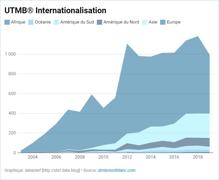
After many tries, I think I’ve found the right way to visualize all the UTMB® results in a single graph. As box-plot is too complicated (And also not available in Data Studio…) I used a scatter plot graph with one year per line. Each dot is an athlete. There is a different color to distinguish women and men. Then, I separatly calculated the 0.75 fractile to add an area behind the graph to represent it. Finally, I added some notes to explain it and highlight some interesting insigths with OneNote and that’s it:
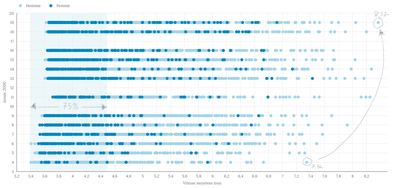
![]() Après plusieurs essais, je pense avoir trouvé le bon moyen de visualiser tous les résultats UTMB® dans un seul graphique. Comme la boîte à moustaches est trop compliquée (et qu’elle n’est pas non plus disponible dans Data Studio…), j’ai utilisé un graphe à nuage de points avec une année par ligne. Chaque point est un athlète. Il y a une couleur différente pour distinguer les femmes et les hommes. Ensuite, j’ai calculé séparément le fractile 0,75 pour ajouter une zone derrière le graphique pour le représenter. Enfin, j’ai ajouté quelques notes pour l’expliquer et mettre en évidence quelques informations intéressantes avec OneNote et voilà.
Après plusieurs essais, je pense avoir trouvé le bon moyen de visualiser tous les résultats UTMB® dans un seul graphique. Comme la boîte à moustaches est trop compliquée (et qu’elle n’est pas non plus disponible dans Data Studio…), j’ai utilisé un graphe à nuage de points avec une année par ligne. Chaque point est un athlète. Il y a une couleur différente pour distinguer les femmes et les hommes. Ensuite, j’ai calculé séparément le fractile 0,75 pour ajouter une zone derrière le graphique pour le représenter. Enfin, j’ai ajouté quelques notes pour l’expliquer et mettre en évidence quelques informations intéressantes avec OneNote et voilà.